EN
EN


In today’s intensifying competition for visual attention in consumer goods, color has long ceased to be mere packaging decoration; it has become the most direct emotional bond between a brand and its consumers. A successful product often delivers its key value proposition at the very first glance—even before any text is read. Recently, we partnered with a client dedicated to creating a “natural, pure, and soothing” brand experience, successfully completing a custom “Water-Lake Blue” color project for 45mm preforms. From an abstract spark of color inspiration to the final, stable mass production of millions of preforms that illuminate retail shelves, this journey has been a deep value co-creation where technology and aesthetics worked in close harmony. Below, we fully reconstruct the entire process, hoping to provide a reference for more brands exploring the path of packaging differentiation.
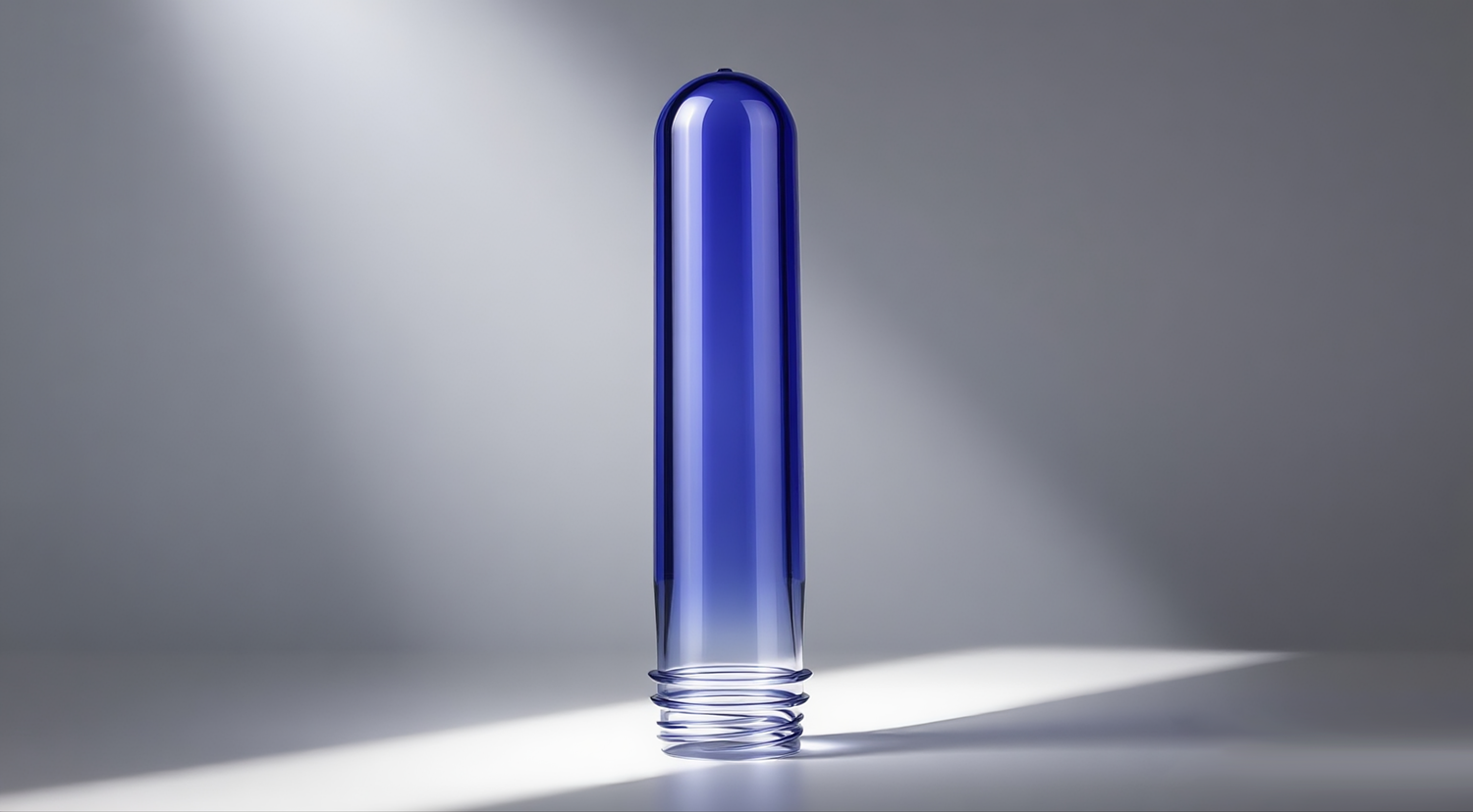
The client was launching a premium drinking water series themed around “as crisp as a mountain spring, as serene as a lake.” At the start of the project, the client’s design team brought a photo of an alpine lake in morning mist—the water displayed a subtle hue somewhere between blue and green, clear, soft, and tranquil. The client wanted the bottle color itself to become the core language of the product: a proprietary blue that instantly evokes pure water sources and conveys a feeling of “cool, pure, and relaxing.”
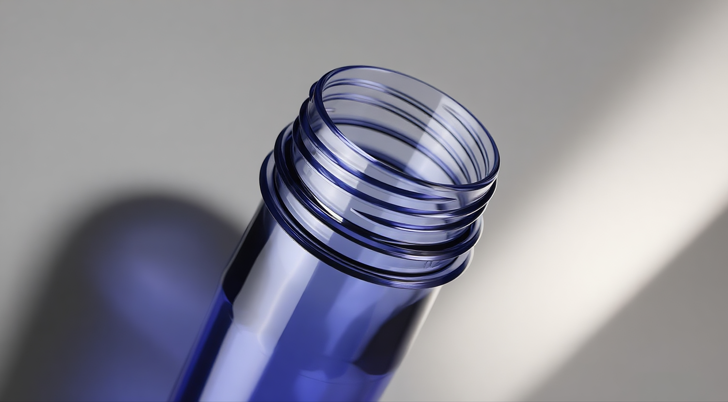
Through multiple in-depth discussions with the client’s product, marketing, and supply chain teams, we gradually translated this emotional aspiration into concrete, actionable technical and commercial goals:
1. Visualizing Brand Ambience
This was not an ordinary light blue or sky blue. It needed to carry a subtle greenish undertone—possessing both the calmness and rationality of blue, as well as the vitality and naturalness of green. What’s more, this blue had to maintain a consistent visual appearance under various lighting conditions:
Under the cool white light of supermarket coolers, it needed to appear refreshingly bright and translucent, not dull.
Under the warm yellow light of home dining tables, it had to remain soft and comfortable, not overly garish.
Under outdoor natural light, it had to restore the transparent texture of lake water, without any color shift.
In short, the client did not want “a blue bottle”; they wanted “a bottle that looks like it holds a pool of lake water.”
2. Differentiation Power in the Market
In the current drinking water packaging market, clear PET bottles still dominate. The few brands that experiment with blue packaging mostly focus on dark blue or mint green ranges. The client hoped that this unique “Water-Lake Blue” would create a distinct visual jump on supermarket coolers or shelves—allowing consumers to instantly recognize “that’s the lake-blue brand” among a sea of bottles. At the same time, the color itself needed to convey a quality feel and natural tone superior to competitors, supporting the client’s premium pricing strategy.
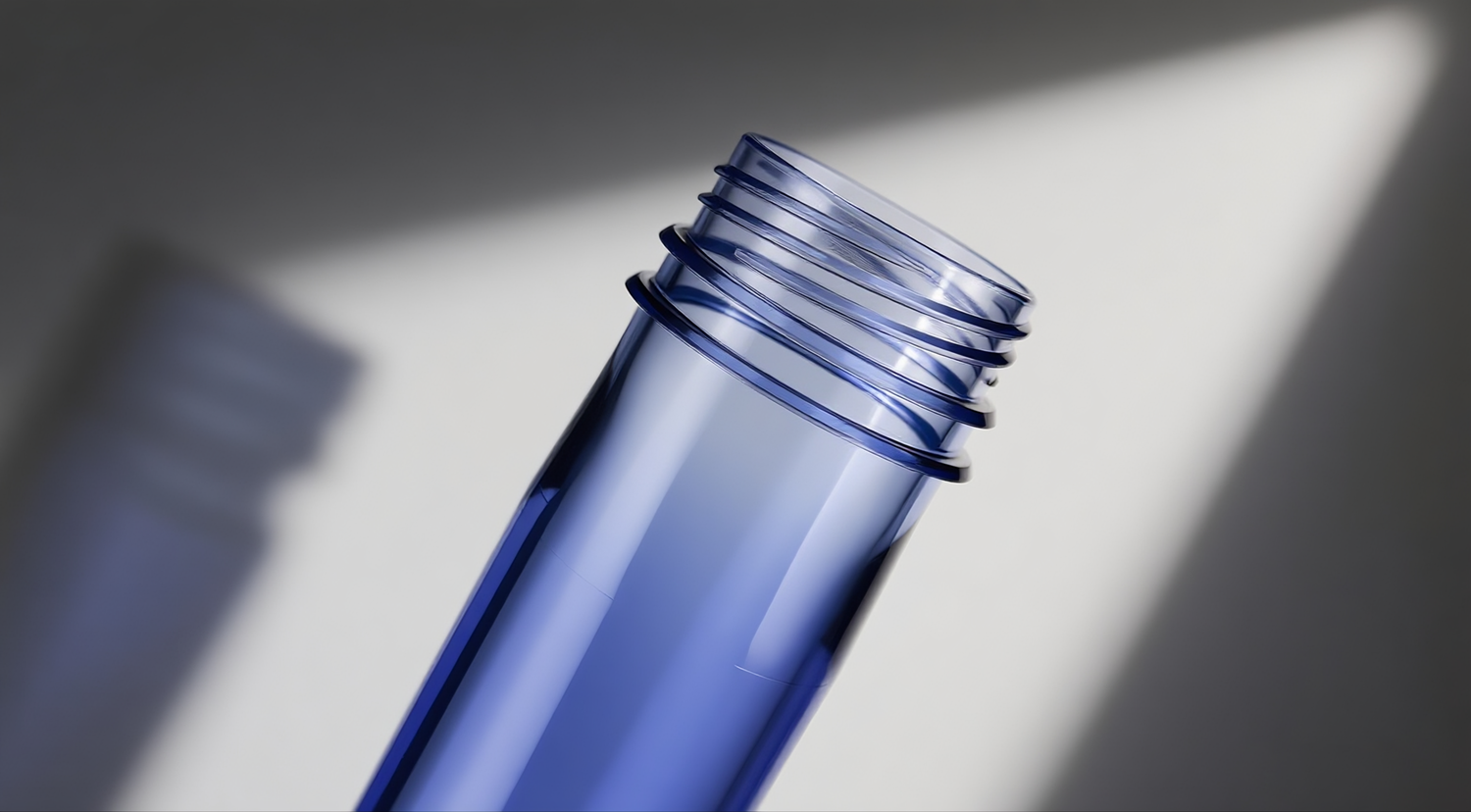
3. Stringent Industrial Standards
A beautiful color idea must be stably realized through industrial processes, otherwise it cannot create real commercial value. The client put forward three core technical requirements:
Absolute Color Consistency: The initial order quantity was in the millions, with subsequent repeat orders expected. The color difference (ΔE) between preforms produced across different production batches and different injection molding machines had to be consistently controlled below 0.8 (indistinguishable to the naked eye), ensuring that products from the same batch and different batches look identical at the point of sale.
Safety and Compliance: All added color masterbatch components and additives had to comply with the most stringent global food contact material regulations (e.g., FDA, EU 10/2011, GB 4806 series), ensuring absolute safety during long-term use with no migration or exudation of colorants.
Process Compatibility: The 45mm preforms needed to perfectly match the client’s existing high-speed blow molding and filling lines. After blow molding, the color on all parts of the bottle (shoulder, body, base) had to be uniform, without any stretch-induced whitening, and without affecting the mechanical properties (e.g., compressive strength, drop resistance) or barrier properties of the bottle.
Transforming an emotional “Water-Lake Blue” into millions of stable, consistent products required rigorous scientific methods and engineering capabilities. For this purpose, we initiated our in-house “Custom Color Development Process,” jointly executed by the Color Lab, Materials R&D Center, Process Engineering Department, and Quality Control Team.
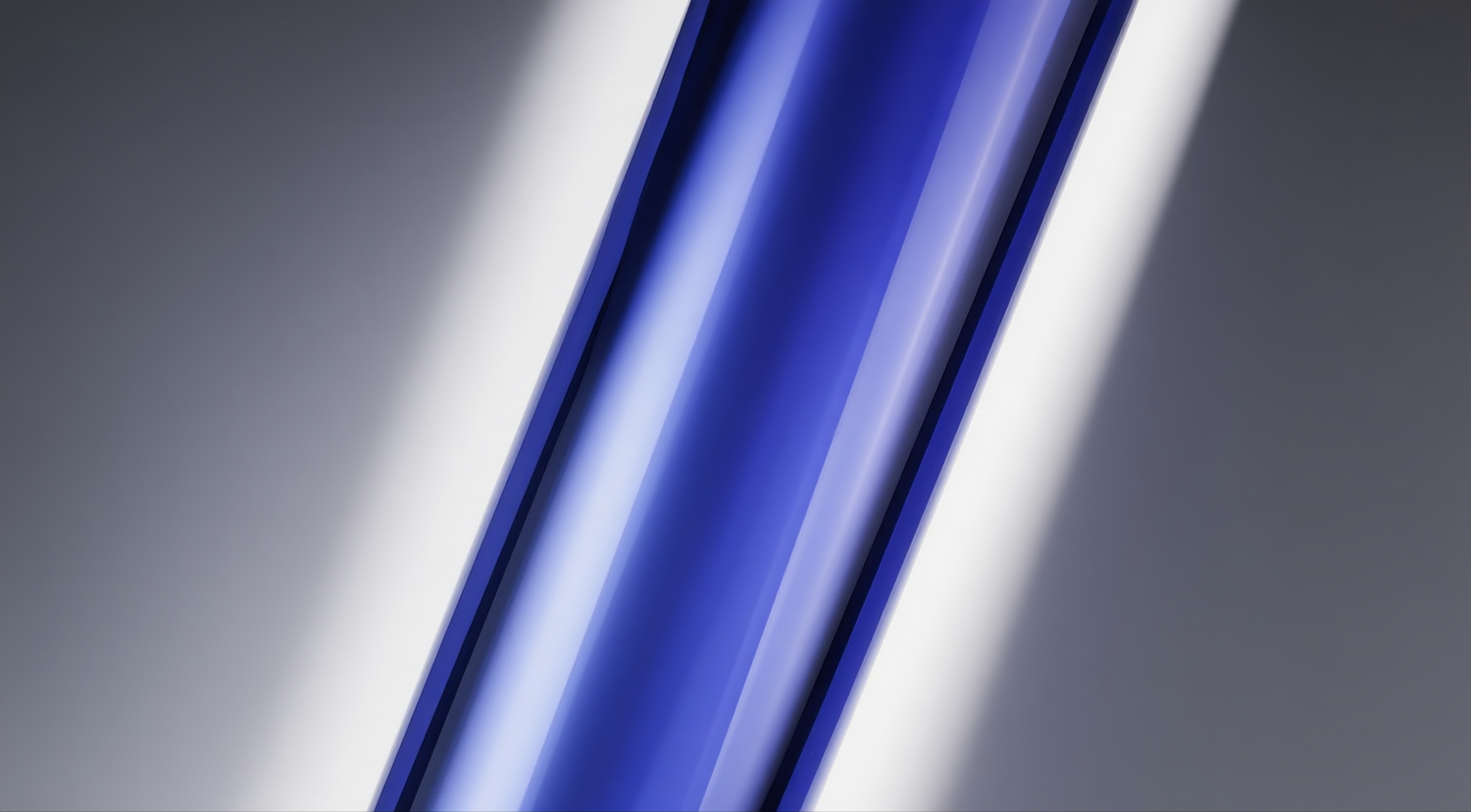
Phase 1: Color Digital Definition and Confirmation
Our color lab held joint working sessions with the client’s creative team. First, using the Pantone color guide as a reference library, we screened nearly 20 candidate color swatches and selected the five blue tones closest to the client’s intent. Then, using a high-precision spectrophotometer, we digitally captured these five colors and conducted visual comparisons under three standard light sources: D65 (simulated daylight), TL84 (simulated cool white light of shopping malls), and A light source (simulated warm yellow light).
After three rounds of screening and on-site confirmation with the client, we eliminated options that were too green (appearing cheap) or too blue (appearing cold and harsh), and finally settled on a unique tone that combined “clarity” and “softness”—a low-saturation blue with a subtle green undertone. We established precise Lab color space values (L, a, b*) for this color, and also set target gloss and light transmittance ranges to ensure that the finished bottle, when illuminated, would exhibit the warm, translucent texture of lake water, rather than a dull plastic or milky appearance.
Phase 2: Custom Development and Optimization of Spot Color Masterbatch
Generic masterbatches could not meet this unique color requirement, nor could they guarantee batch-to-batch stability. Our Materials R&D Center developed a custom “Water-Lake Blue” masterbatch exclusively for this client. The entire process took about three weeks and underwent six rounds of formulation adjustments:
Carrier Selection: We abandoned commercially available generic masterbatch carriers and opted for a food-grade, high-performance copolyester as the carrier material. This carrier has extremely high compatibility with the PET preform base resin used by the client, ensuring uniform dispersion of colorants during melt extrusion, and avoiding color spots, streaks, or degradation of preform mechanical properties caused by poor compatibility.
Pigment System Construction: We selected high-quality organic and inorganic composite pigments that are heat-resistant (withstanding PET injection molding temperatures of 270–290°C) and migration-resistant. The organic pigment provides vivid hue, while the inorganic pigment offers good hiding power and weather resistance. Both pigments underwent special surface treatment and pre-dispersion processes to ensure nano-level uniformity of distribution within the masterbatch.
Precise Combination of Functional Additives: In the masterbatch formulation, we scientifically compounded three functional additives:
Light Stabilizer: Effectively absorbs or shields ultraviolet light, preventing yellowing or fading of the preforms during long-term exposure to light in warehouses or on retail shelves.
Antioxidant: Inhibits thermo-oxidative degradation of the PET resin during high-temperature processing, protecting the bottle’s mechanical properties while avoiding color changes caused by resin degradation.
Optical Clarifier: Added in trace amounts, it optimizes the path of light transmission and scattering within the bottle wall, enhancing the bottle’s clarity and simulating the visual effect of clear water reflecting a lake’s surface, making the color “come alive” rather than sitting superficially.
Phase 3: Full-Process Simulation and Extreme Testing
Before formal mass production, we spent about two weeks conducting systematic sample validation and extreme testing to ensure the formulation performed reliably during scale-up and end-use applications:
Blow Molding Process Test: Trial preforms were sent to a blow molding machine designated by the client (or an equivalent model) and test-blown under different process parameters (e.g., heating temperature, stretch speed, blow pressure). We inspected color uniformity in areas such as the shoulder, body, and base, paying special attention to whether “stress whitening” occurred in high-stretch-ratio areas. Test results showed that our formulation performed stably within the client’s process parameter window, with ΔE ≤0.5 across all areas.
Environmental Stress and Aging Tests: We simulated various harsh environments that the product might experience from factory to end-user consumption:
Finished bottles filled with water were placed in a -5°C freezer and subjected to repeated freeze-thaw cycles.
They were placed in a constant temperature and humidity chamber at 40°C and 90% RH for 15 days to simulate high-temperature, high-humidity warehouse storage.
They were continuously irradiated in a UV aging test chamber for 168 hours to simulate long-term shelf lighting.
After testing, none of the samples showed visible color change, whitening, or degradation of mechanical properties.
Compatibility and Safety Tests: Preforms were assembled with the client’s specified caps and shrink sleeve labels, then subjected to simulated filling (with water and acidic solution) and long-term storage. We tested whether any pigment or additive migration was detected in the contents; all indicators complied with FDA, EU, and GB food contact material standards.
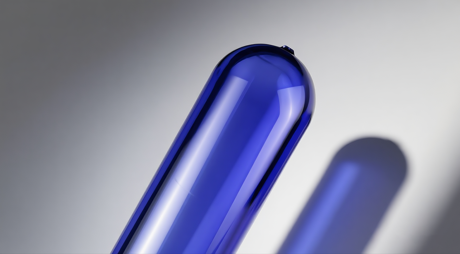
Success in the lab is only the first step; consistency in mass production is the true touchstone of custom capability. For this project, we launched a “Color Guardian” dedicated production and quality control plan, covering end-to-end control from raw materials to finished products.
1. Digital Precision Dosing
During the raw material pre-treatment stage, we used a gravimetric intelligent dosing system to precisely proportion the custom masterbatch and PET base resin. The system dynamically monitors the discharge weight dozens of times per second and automatically adjusts the feed speed, ensuring that the mixing ratio accuracy is controlled within ±0.03%. This source-level precision control locks in the preform’s color baseline at the “genetic” level, preventing batch-to-batch color differences caused by dosing fluctuations.
2. Full-Process Online Monitoring
On the injection molding line, we integrated an online real-time color measurement system based on spectroscopy. The system performs a full-spectrum scan immediately after preforms from each shot and each cavity are ejected, and compares the color data (Lab values) with the standard tolerance envelope. If the detected color difference trend exceeds the preset CPK control range, the system sends an alert to the central control console within seconds and can automatically fine-tune parameters such as back pressure and metering stroke on the injection molding machine, achieving dynamic closed-loop adjustment during production and ensuring that every preform falls within the “color acceptable zone.”
3. Multi-Level Quality Verification System
In addition to online monitoring, we established a three-tier quality verification chain: “online sampling – offline verification – laboratory certification.”
Online Sampling: Every half hour, the production line automatically captures 5 preforms, which are visually compared under a standard light booth by quality inspectors, focusing on whether the hue, saturation, and clarity match the reference sample.
Offline Verification: Samples from the same batch are simultaneously sent to the laboratory for digital measurement using a high-precision benchtop colorimeter, generating inspection reports that include Lab values, ΔE, and spectral curves.
Laboratory Certification: For each production batch, 30 representative samples are retained and stored in a temperature- and humidity-controlled sample library for long-term traceability and comparison. All test data are consolidated into a digital quality archive. Clients can access the complete quality traceability information of their orders at any time through a dedicated portal, achieving full transparency.
Through the operation of the above system, this project achieved outstanding performance in high-volume continuous production, with over 99% of samples having ΔE values below 0.6—far exceeding the client’s target of 0.8.
Three months after project delivery, we received positive feedback from multiple departments of the client. The results were validated in both commercial and supply chain dimensions.
1. Market Performance
According to the client’s sharing, after the new product series using the “Water-Lake Blue” custom preform was launched in key regions, its performance far exceeded expectations:
Without large-scale advertising, the unique packaging color triggered considerable spontaneous consumer sharing on social media within the first week of shelf placement, generating early word-of-mouth communication.
The client commissioned a third-party survey on purchase drivers for the new product. The results showed that “the bottle color is beautiful and soothing” was cited by a significant proportion of consumers as one of the main reasons for first purchase, second only to “trust in the water source.”
Within two months of launch, the new product achieved over 120% of its sales target, helping the client rapidly establish a differentiated brand presence in the regional premium water market, with some channels even experiencing stock-outs and reorders.
2. Production and Supply Chain Performance
The custom preforms exhibited excellent processing stability, with a blow molding yield rate consistently above 99.5% on the client’s production line—an improvement of about one percentage point over the general-purpose preforms previously used by the client, effectively reducing production waste.
Due to the absence of color difference between preform batches, the client did not need to repeatedly adjust blow molding parameters during batch changes, improving overall equipment efficiency.
The color stability of these preforms stood the test of production across different seasons and temperature environments, laying a reliable foundation for long-term stable supply.
3. Brand Asset Accumulation
This “client-exclusive Water-Lake Blue” has been filed by the client for appearance design and color intellectual property protection, formally becoming one of the core elements of their brand visual identity system. The client plans to extend this color to other product lines under the same brand (such as sports drinks, sparkling water, etc.), forming a unified brand visual genealogy. We have delivered to the client a complete technical dossier for this color, including: Lab standard values, custom masterbatch formula code, production process parameter template, quality control work instructions, etc., providing a full technical basis for the client’s future in-house quality control or development of a secondary supplier.
The entire process of this 45mm preform Water-Lake Blue custom project once again validates several core principles that are becoming increasingly important in today’s market environment:
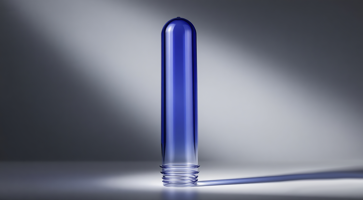
1. Packaging’s Color Competitiveness Begins at the Preform Customization Stage
Adding color to finished packaging (e.g., spraying, labeling) is often costly, inconsistent, and not environmentally friendly. Truly high-value color differentiation should be accomplished at the source—the preform stage. By incorporating a proprietary masterbatch into the PET base resin, the color “grows” inside the bottle wall, never peeling off or wearing away, and remains highly consistent throughout the entire supply chain.
2. Color Is Emotional Aesthetics, But Also a Precision Science
Behind a seemingly simple color lie multiple disciplines: polymer material compatibility, optical design, precision metering, online inspection, and more. Successful color customization requires deep collaboration between the brand and its supply chain partner at every step—creativity, materials, process, quality control—rather than simply “picking a swatch and telling the factory to make it.”
3. The Supplier’s Role Is Evolving from Executor to Co-Creator
We are no longer just producers who passively take orders and process according to specifications. We are proactive “brand color partners” who engage early in the client’s creative phase and provide systematic technical support. Our value lies not only in “making it happen” but also in “helping the client think it through”—translating fuzzy brand concepts into quantifiable technical parameters and building a reliable bridge between creativity and mass production.
4. The Best Collaboration Is One Where the Client’s Brand Becomes More Recognizable Because of Us
When a consumer stops in front of the shelf, picks up the bottle, and ultimately makes a purchase because of that unique touch of Water-Lake Blue, that is the truest affirmation of our professional capability. We look forward to creating such moments together with every forward-thinking client.
Let color speak for your brand, and let technology safeguard your creativity.
We focus on casting your brand vision into every gram of material, creating that unique scenery in the market.

Taizhou Huangyan Jinting Plastic Mould.,LTD is a professional PET preform manufacturer with 25+ years’ expertise. ISO9001/ISO22000 certified, custom necks (28–55mm), colors, weights & molds for water/beverage brands. Contact us today.
Puhui Industrial Zone, Toutuo Town, Huangyan District, Taizhou City, Zhejiang Province, China
Copyright © 2026 Taizhou Huangyan Jinting Plastic Mould.,LTD.All rights reserved. Privacy Policy